How to gain real insights from Google Trends
Google Trends is a powerful, evolving tool for analysing markets and consumer demand.
It can also be ambiguous and provide baffling graphs.
We look at how to get started on the path to real insights.
Let’s Get Benchmarking
Google Trends gives access to chart keywords, topics and brands over time, and against each other. The resulting benchmarks are easy to pull. Simply choose the search term, location, and time span.
For example, here is the ‘search interest’ of ‘lion king’ over the past five years in the UK, with a spike coming in July 2020 when the live action film came out:
Search Terms vs Topics
A topic includes misspellings, related terms, and the same search query across multiple languages. It’s a more powerful tool for market insights and trends, therefore, but of course there may be more granular insights from a search term by search term analysis as well.
Search term strings can also be refined using plus or minus between words: + for OR, and - for excluding, i.e. camp + bed (camp or bed), camp - bed (camp excluding camp bed).
Making Comparisons
The tool gets deeper if you then compare one search term or topic to another.
This needs more careful selection of the terms, and time period, as a big spike can skew the comparison. You also need to begin with a question to answer.
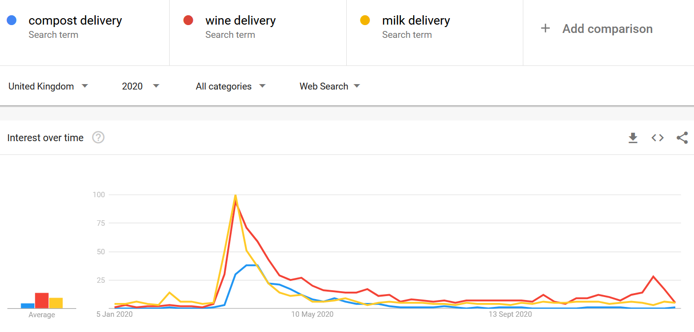
For example, my question is: what delivery services were people in the UK searching for in 2020, and when?
I’ve chosen three kinds of delivery service - and I’ve found that they all spiked in the spring, with milk peaking at the top. The UK went into lockdown at the end of March 2020, so this spike correlates to what we know about an obvious cause.
Useful Expansion
Of course, there may be other deliveries I didn’t think of. For this, Google will suggest similar topics, and will also round up ‘trending searches’ for the year. For example, these were the top ten delivery search strings:
If I had been analysing ‘delivery’ terms throughout the year, I could have subscribed to them and received automated emails from Google Trends to alert me to changes to the search behaviour in a topic.
How Not To Look Stupid
What does the scale in Google Trends actually mean? Google Trends data is compelling when it shows comparisons over time - but if you show it to someone used to more concrete business benchmarks to make an argument, they may ask: what do these numbers actually show? What’s the scale?
Well, on the face of it it’s quite simple. It’s all relative.
The particular interest or topic you type in is compared to the total search volume in that time and place. The result is then normalised to produce a number between 0 and 100, where 100 is simply the highest point tracked in that time period.
Every graph will therefore peak at 100 somewhere. For example, if I remove ‘milk delivery’ from the above data, now ‘wine delivery’, as the next highest peak, will move up from 78 to hit the 100 mark.
The indices shown in this table are for the UK, over the past 3 years. Google Trends data points compare the interest in a particular topic, in a particular place and time, to the total searches on Google in the same place and time. These numbers are then normalised from 0 to 100, where 100 is the maximum search interest for the place and period selected.
As such these are powerful ways for showing movements over time, always compared to the total.
Google Trends won’t tell us how many people actually searched for ‘milk delivery’ - all we know from the above is that it was more than ‘compost delivery’, and it spiked in March 2020.
The data is also ‘sampled’ - i.e. only based on a representative sample of the total number of searches. This makes it accessible, and the scale of the searches going through Google’s search box makes this more than enough to analyse.
Deeper Consumer Insights
Using the methods above, Google Trends can track and alert you to demand patterns - for products and services growing or dwindling, and for the keywords and questions people are using to try to find those products and services.
The latter leads to a deeper use of the tool for business. It tells you about the way people conceive of your industry, and how they expect businesses to be meeting their needs.
The rise in ‘delivery’ terms during the Covid pandemic is a clear example. A long-term shift is exemplified by a change in people’s sense of services in their local area. In 2015, ‘near me’ became a more common term than ‘local’ - smartphone apps, GPS, maps and the simplicity of adding ‘near me’ onto whatever you’re looking for:
One final trick
You can also compare the same search term in different countries.
For this pro level tip, add the same term several times then click ‘open filter’ to select a new country for each iteration.
For example, although ‘pizza’ searches are fairly level between the US and UK over the past five years, the US is seeing a rise in ‘pizza near me’ relative to the UK:


